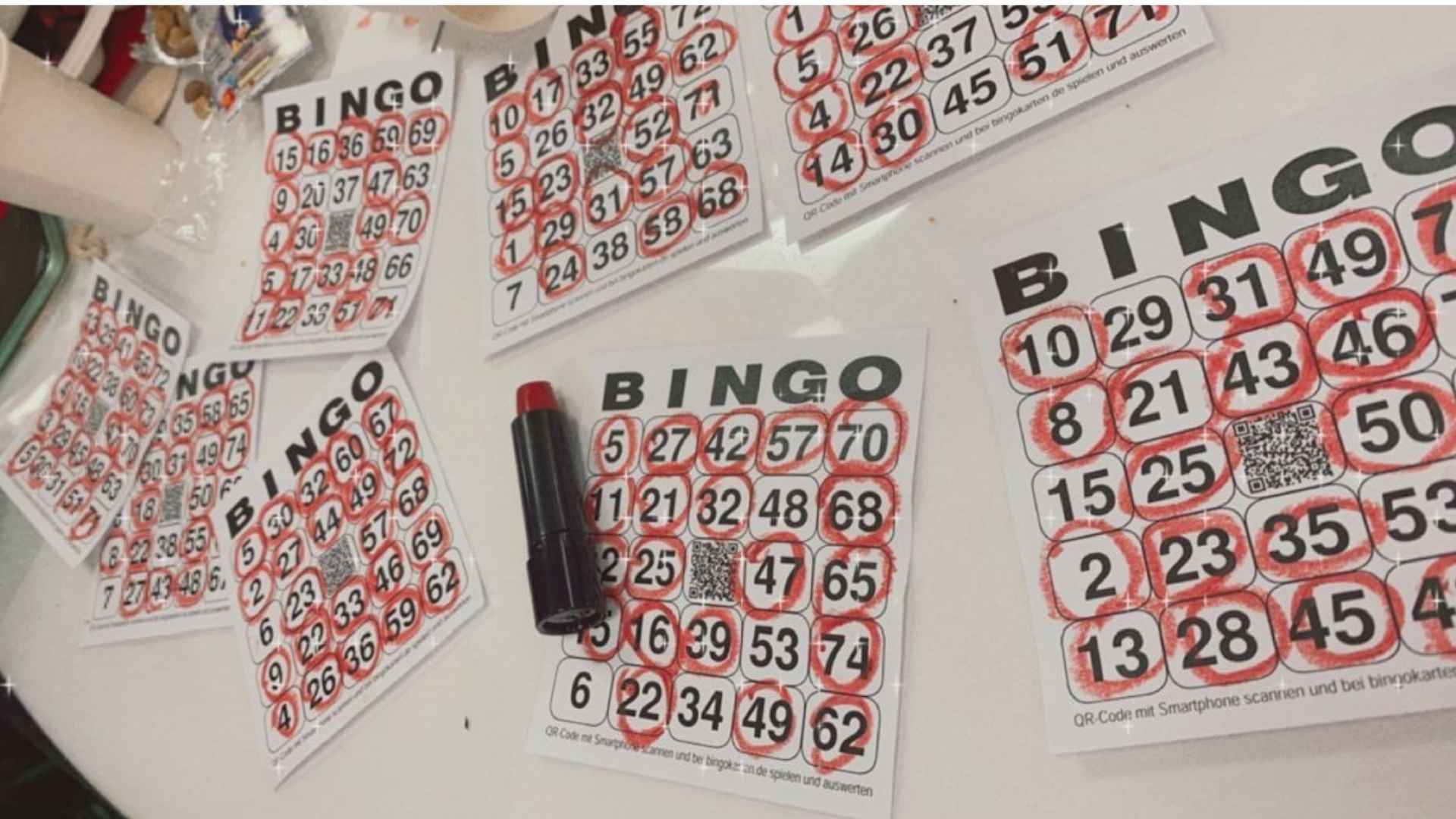
In modern digital ticketing platforms, visual presentation directly influences how rapidly users process critical information. Clean typography acts as an invisible guide that accelerates the verification process for both event staff and ticket holders. By selecting legible typefaces and establishing structured visual hierarchies, digital platforms eliminate unnecessary friction during entry checking.
The Role of Font Choice in Visual Clarity
Selecting the right typeface is essential when designing digital tickets meant for immediate review. Sans-serif fonts with distinct letterforms prevent ambiguous characters from confusing inspectors during high-speed scans. High contrast between text and background further ensures that numbers remain readable under diverse lighting conditions.
Proper font weight selection prevents thin strokes from disappearing on dimly lit smartphone screens. Maintaining consistent character spacing also reduces visual crowding, allowing auditors to spot entry details instantly. These deliberate visual choices collectively streamline real-time ticket validation.
Establishing Layout Hierarchy for Rapid Scanning
Organizing information logically allows users to scan essential ticket details in fractions of a second. Primary elements like ticket IDs, seat numbers, and draw codes should feature larger sizing to immediately draw the eye. Secondary information can reside lower in the visual hierarchy without creating clutter.
Strategic use of whitespace around critical text blocks isolates key data points from surrounding graphical elements. This clear structural separation minimizes cognitive load for staff verifying hundreds of passes during continuous check-in windows. Thoughtful layout balance ensures crucial validation data stands out effortlessly.
Reducing Friction in Fast-Paced Verification Environments
In crowded venues or rapid digital sessions, delays in confirming entry credentials create unnecessary bottlenecks. Clean typographic arrangements significantly lower error rates by helping checkers cross-reference numbers accurately without second-guessing blurry text. Clear visual feedback empowers both users and operators to proceed with confidence.
Optimizing typography for screen rendering ensures text remains crisp regardless of screen resolution or scaling factors. When digital slips prioritize quick legibility, overall throughput increases while keeping operations smooth. Prioritizing typographic clarity ultimately builds a reliable, user-friendly verification environment.
Best Practices for Modern Digital Ticket Interfaces
Platform designers must test font styling across various handheld devices to maintain uniform readability. Limiting the number of type families per ticket keeps the interface clean, cohesive, and distraction-free. Consistent alignment across data fields further helps the eye track information naturally.
Incorporating responsive styling ensures that numeric strings adjust smoothly across different display dimensions without awkward line wraps. Regular interface audits help identify visual pain points before they affect real-world check-in efficiency. Investing in clear design standards continues to be a vital strategy for digital platform success.